My city underwent a branding exercise a few years ago and should have taken a lesson from Prince’s songbook on how to effectively use color. While their primary logo is in orange, I don’t think I have seen anything else that is. The street signs are blue. The recycling bins are red. The councilmen’s shirts are royal. The bills are in blue. The police car is silver with red lettering. There is not a square of orange to be found in the new building.
It is a lost opportunity to choose a distinctive color and then opt to ignore it. Crayons come in boxes of eight colors or more, but effective brands rely on one or two.
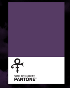
Pantone Love Symbol #2
No comments:
Post a Comment