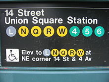
Determining a font style, kerning and color palette does not seem like sexy work, but it is through the consistency of application that the subway signs have become art. There is no variance is what is acceptable and this repetition makes them memorable.
Those who write standards manuals and enforce the application of them are often seen as nitpickers. I remember supporting the graphic designer who reprinted an entire order of notecards because the color was slightly off. Others wanted to keep them and “use them internally” but we recycled the whole lot. I am sure the NYC subway folks would have done the same.
There is a dual meaning to “standard” – and creating a standards manual that you strictly follow will make your work a gold standard for others to follow.
 |
| http:standardsmanual.com |
No comments:
Post a Comment