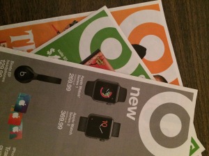
If I asked you what color Target "owned", I'll bet that most of you could say red. It's the signature color of their bullseye logo, shopping carts, clerks' attire and packaging.
A few weeks ago, the Target flyer appeared in the paper using blue (as in Walmart blue!) instead. Then there was green, followed by orange and now a gray. It makes no sense to me.
When I was working on a campus, people would often get tired of using -- and reusing -- the school colors. They would want to "mix it up" and interject a new color in the palette. Bad idea. If you have a color that seems to be everywhere, take it as a sign that your branding is working, not in need of a refresh. If they're not seeing red, I think Target is missing its mark by using anything else.

No comments:
Post a Comment